myfitnesspal | case study & redesign
Refining the user experience and motion of a calorie tracking & fitness app through user pain points and requests.
Timeline: 3 Weeks (September 2025)
This project is not affiliated with MyFitnessPal in any way. This is a personal project done for practice and experience.
(breakdown pictured below)
This redesign project marked my entry point into the world of UI/UX while allowing me to apply my Motion Design skills in a practical, interactive way. It was also my first deep dive into Figma, which has quickly become my favorite design tool. I used AEUX to bring my Figma designs into After Effects as Motion Design assets, and the process worked like a charm.
Tools
Figma
After Effects
Lottie/BodyMovin
AEUX
//Context
Why?
Role
Interaction Design
Wireframing
User Research
UI/UX
I’ve been an avid user of MyFitnessPal for around four years, and the UI/UX design has always been an issue for me and many others. Often, I’ll open the app after a few weeks and be greeted with a completely new UI, and I’ll find myself googling where to find that one particular tab that houses what I want to see.
MyFitnessPal is a huge app, but at its core, its main purpose is calorie tracking. That’s why I think it’s essential that everything related to calorie tracking and personal progress is easy to see, understand, and celebrate.
The app needs to be responsive but satisfying to use. Right now, MyFitnessPal is a functional app, but it feels mundane and lacks motion. Weight loss can be hard, and it’s important to celebrate every little win, and MyFitnessPal could do that better.
//Scope
areas of focus
The three aspects I chose to hone in on were:


//User Research
USER PAIN POINTS
In addition to my focus areas, I wanted to acknowledge user pain points to further aid in my redesign. MyFitnessPal has had very controversial UI/UX updates, but users cited these aspects of the mobile app as pain points the most:
1: “Cluttered, outdated, and sometimes unintuitive UI.”
2: “The diary doesn’t have a consistent design language compared to other app parts.”
3: “I can’t find the progress section/You shouldn’t have to scroll to find weight; it should be its own tab.”
Through researching user behavior and pain points, it’s become apparent that the vast majority of MyFitnessPal users primarily use the Calories Counter, Weight Logging, and Food Database/Diary features.
//Design Drafts
basic LO-FI wireframes
Considering user pain points and my focus areas, I created SUPER simple wireframes to guide the final design and intended motion. The wireframes highlight what I tried to change to improve the overall User Experience.


(dashboard)

(diary)
(progress)
(more)
The dashboard was re-designed with the hierarchy of importance in mind. Users had expressed frustration with the macros tab being buried behind multiple clicks, so it is now accessible directly from the dashboard. The diary and “More” tabs also lacked a consistent design language with the rest of the app, creating an outdated feel. In my wireframes, I worked to establish a more unified design system across these elements, primarily reinforcing the dashboards usage of rounded rectangles. Finally, the progress tab now replaces the “Meal Planning” tab, addressing user concerns about its previous placement.
Side-by-side comparison will be shown in the final design(s).
//Design Drafts
motion
Effective motion design should reinforce design systems. In the case of MyFitnessPal, I as a motion designer, need to reinforce and reward the user with satisfying motion and animations parallel to the app’s intended design. The current motion design within the app is somewhat effective. Some examples of motion within the app are:
While keeping in mind the motion identity already present in MyFitnessPal, we can draft some motion design improvements to further improve the user experience.
Simple but clean fade and slight scale up upon switching tabs.
Awesome shape morph animation, but redundant “Food Logged” animation.
//Design Drafts
motion drafts
1: In place of the fade/scale up when swapping tabs, we’ll use a cascading slide and fade upwards to guide the viewer’s eyes from top to bottom.
This supports the wireframes, showing the viewer the most important things to them first, based on user reports.
It’s imperative that the speed of the animation is quick enough to not interfere with the user. This addition is just to add responsiveness to the app, not slow the user down.

(general animation)
2: To add more interactive animation, I opted to add an animated number counter and progress bar for more visual interest and interactivity.
The idea is that for important information that the user influences, like macros, calories, and exercise, a sliding numerical value (a Lottie-compatible animation) and an increasing visual indicator will be implemented to show the user’s progress towards their daily targets.
This change is a secondary animation to the global slide up upon swapping tabs, pictured above.
(specific-secondary animation)
3: Improve the food logging system. The original “Food Logged!” notification has some wonky overshoot. It just appears without a transition and disappears with a hard cut.
This rendition should better fit the motion design identity I’m trying to build for my redesign and assist the overall motion and UI achieve a more “modern” feel.

(UI pop-up animation)
//Final Design
ui redesign
Here’s the side-by-side comparison for each re-designed UI panel compared to their original states.


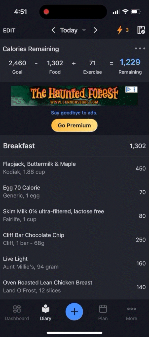
ORIGINAL
Great UI, but it sets a visual precedent the rest of the app doesn’t follow. Also clutters UI with some less-useful information according to user reports.
(yes there really is that much on the dashboard, and these appear upon scrolling)

REDESIGN
Much simpler, users see the most important information first.
Added a more “global” header with the profile, logo, and premium so the user always has an option to become a premium member, but without disrupting the users general experience.


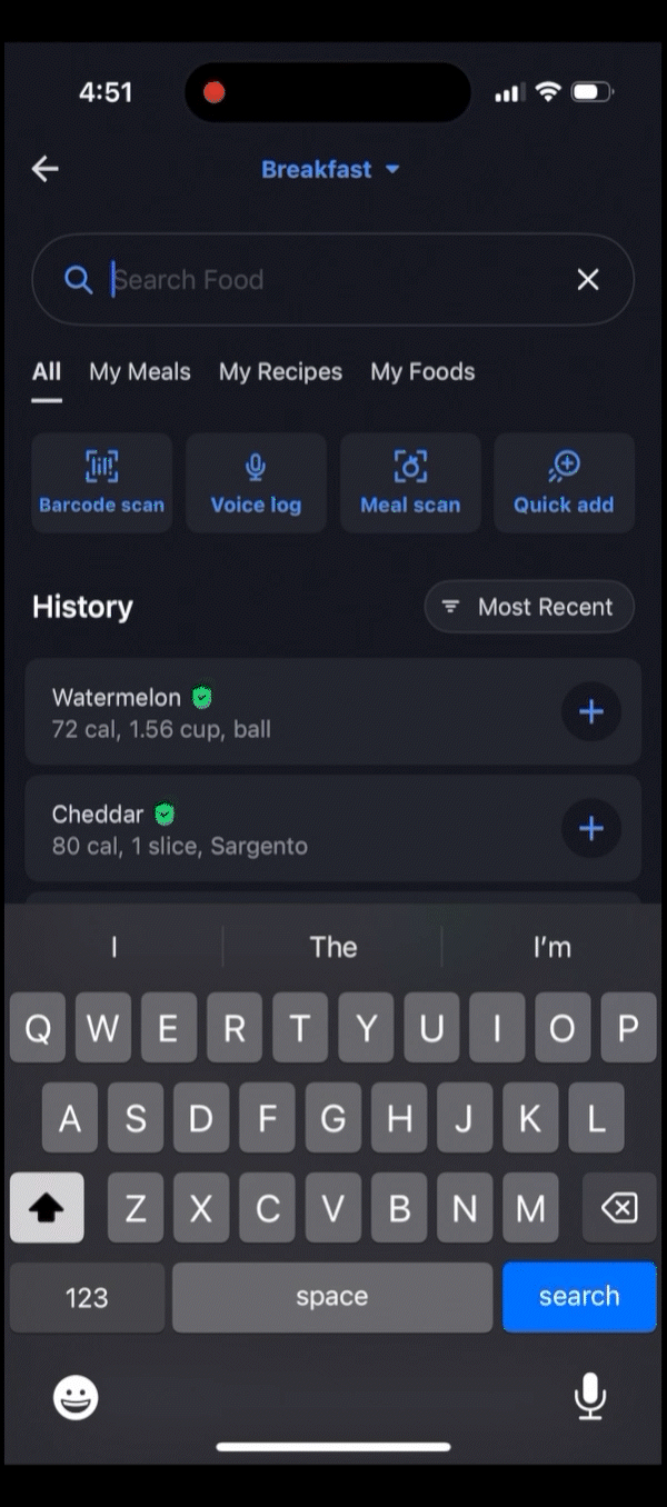
ORIGINAL
The original design is not cohesive when paired with the original and re-designed dashboard. With the design language present on the dashboard, and important information is tucked away at the bottom.
(the nutrition tab, now moved to the dashboard in my redesign).

REDESIGN
Design is much more cohesive with the dashboard.
However, this tab is dictated by the amount of food entries input by the user, and because of that, it isn’t scaled correctly to show as much of the tab in a realistic use case as possible. In a real in-app scenario, there would be the option to scroll down; in this case, the original reference is essential!
(the information should be larger on the screen in actual use)
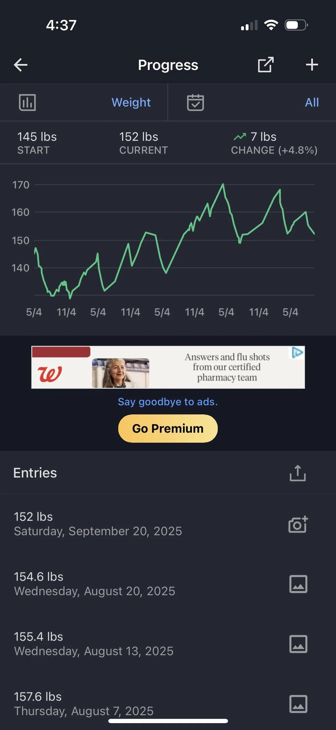
ORIGINAL
Very nice UI with visuals and appropriate stats, but again, we can further improve the visual cohesiveness of the entire app by creating consistency in the design language.
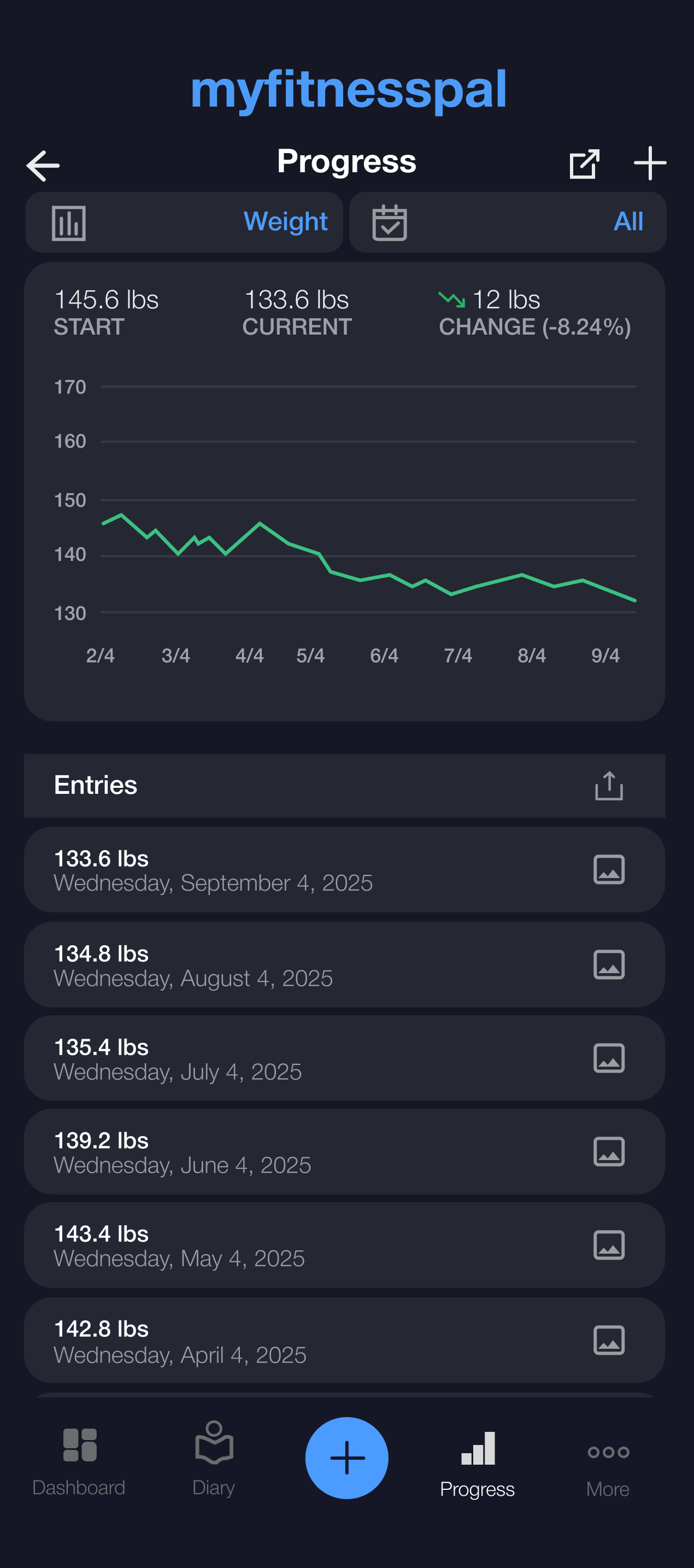
REDESIGN
The design is much more in line with the rest of the app due to the use of rounded rectangles. Progress has also become its own tab, as per user requests. Its importance was undervalued in the app’s original design.


ORIGINAL

HUGE number of options. It seems they have the “more” tab as a room to shove everything they can’t fit in other places into. In an effort to remain thumb-friendly, they clutter “more” with options, so many that it can be hard to find what you’re actually looking for. There are also some recurring tabs that are seen in other parts of the app, anyway.
REDESIGN
The design is much more congruent with the rest of the app, and while still packed with options, the sheer number of options has been cut in half. Some options, like “Friends,” have been lumped in with others, like “Messages,” to streamline the page, and recurring options have been removed to reduce clutter. A search bar has also been implemented to help users find exactly what they want.
ui/ux & motion
//Final Design
I decided to combine all of my newly created UI elements and throw together a video that would show the new design in action, with added motion design to make the app feel more interactive and lively. All of these animations are lottie compatible!
I made sure to make input into the diary feel highly interactive and rewarding. The original Checmark morph animation was amazing, and I thought that to improve it, I should add anticipation to it to make the animation feel that much more satisfying.